U.S. Egg Brand Guidelines
Professional brand guidelines for marketing teams, graphic designers, print vendors, and creative partners. This comprehensive style guide provides everything you need for consistent visual brand application across print, digital, and promotional materials.
Print-Ready Colors
Complete CMYK, Pantone, and RGB specifications for all media
Typography System
Font families, weights, and usage guidelines for all applications
Logo Usage
Logo files, placement rules, and proper usage standards
Interior Design Guidelines
Looking for comprehensive interior design guidelines? Access our detailed guide for creating authentic U.S. Egg restaurant environments.
View Interior Design GuideBrand Color Palette
Our five primary brand colors with HEX and CSS-token values for digital use, plus the full 10–95 tint scale shown as a gradient for each. For print specs (CMYK and Pantone) and vector files, download the 2026 logo pack below.
Brand Navy Scale (10-95)
Primary brand color with complete Material 3 token scale
Navy 50
#313d79Main brand color
var(--color-brand-navy-50)Brand Red Scale (10-95)
Accent color for critical actions and alerts
Red 50
#B90C3DPrimary brand red
var(--color-brand-red-50)Brand Orange Scale (10-95)
Primary CTA color and warm interactions
Orange 50
#ea9932Primary brand orange
var(--color-brand-orange-50)Brand Amber Scale (10-95)
Highlight color for emphasis and warmth
Amber 50
#FCD34DPrimary brand amber
var(--color-brand-amber-50)Brand Green Scale (10-95)
Success states and positive actions
Green 50
#8cbc42Primary brand green
var(--color-brand-green-50)Typography System
Our brand uses three font families: Bebas Neue for the logo, Roboto Flex for all headings and body text, and Montserrat for navigation and buttons. All fonts are available free from Google Fonts.
Brand Fonts
Bebas Neue
Logo Text ("U.S. Egg")
Bold, condensed sans-serif used exclusively for the logo text
Roboto Flex
Headings & Body Text
Variable font providing flexible weight options for all text content
Montserrat
Navigation & CTAs
Used for navigation links and call-to-action buttons
Typography Usage Examples
Heading 1
Heading 2
Heading 3
Heading 4
Body Default
Body Large
Caption Text
Quote Text
Logo Usage & Print Guidelines
Essential guidelines for logo usage, print specifications, and brand application across all media. Follow these standards to maintain brand consistency and professional quality in all your materials.
Logo Usage - DO's
File Formats & Resolution
- ✓ Use PNG files for digital screens (72-150 DPI)
- ✓ Use 300 DPI minimum for all print materials
- ✓ Use vector files (SVG, AI, EPS) for scalability
- ✓ Always maintain transparent backgrounds
- ✓ Request print-ready files from us if needed
Spacing & Clear Space
- ✓ Maintain minimum 1/2 logo height clear space on all sides
- ✓ Use only on solid, high-contrast backgrounds
- ✓ Always preserve original aspect ratio
- ✓ Minimum size: 1 inch width for print, 24px height for digital
- ✓ Center logo when used alone
Color & Print Specs
- ✓ Use CMYK color mode for offset printing
- ✓ Use RGB color mode for digital screens
- ✓ Use only brand-approved color values
- ✓ Request Pantone matching for spot color printing
- ✓ Always test color reproduction before final production
Professional Standards
- ✓ Always use current, official logo files
- ✓ Ensure logo is legible at viewing distance
- ✓ Consider substrate and finish (matte vs glossy)
- ✓ Approve final proofs before production
- ✓ Contact us if you need guidance on logo usage
Logo Usage - DON'TS (2026 Standards)
Backgrounds & Placement
- ✗ Never place over complex backgrounds, patterns, or textures
- ✗ Never place over photographs or busy imagery
- ✗ Never use on low-contrast backgrounds (e.g., white logo on light gray)
- ✗ Never crowd logo with other elements - respect clear space
- ✗ Never place logo in corners or edges without proper spacing
Effects & Modern Design No-Nos
- ✗ Never use bevels, emboss, or 3D effects (outdated)
- ✗ Never add drop shadows, glows, or halos
- ✗ Never use gradients in text or as backgrounds
- ✗ Never stretch, skew, rotate, or distort the logo
- ✗ Never apply filters, textures, or artistic effects
Colors & Quality
- ✗ Never change or modify brand colors
- ✗ Never use rasterized or pixelated versions
- ✗ Never compress files to poor quality (artifacts visible)
- ✗ Never use logos smaller than minimum size specifications
- ✗ Never use outdated or unofficial logo versions
Typography & Modifications
- ✗ Never add text, taglines, or additional typography to the logo
- ✗ Never outline or add borders around the logo
- ✗ Never use as a pattern, watermark, or tiled background
- ✗ Never recreate or redraw the logo
- ✗ Never use in animations or video without approval
Technical Print Specifications
Resolution Standards
Color Modes by Application
File Formats
Logo Files Available
Logo Variations
Two official 2026 logo shapes — the license plate for horizontal space, and the round mark for social and mobile. Solid and transparent versions are provided.
License Plate
Primary horizontal logo — use anywhere there is room (headers, print, email)
Round (Social)
For social media profiles, mobile, and any tight or circular placement
Advertising & Hero Menu Items
Professional standards for promoting hero menu items and specialty items. Hero ads showcase food from the front in horizontal scale, displaying ingredients and value against complementary backgrounds.
Hero Ad Style Guidelines
Photography & Composition
- ✓ Show food from the front at 45-degree angle or horizontal scale
- ✓ Display main item as the hero - centered and dominant
- ✓ Include complementary sides (fries, fruit, garnish)
- ✓ Showcase ingredient visibility and quality
- ✓ Use white or light ceramic plate as base
Background & Lighting
- ✓ Bright, natural-looking lighting to highlight ingredients
- ✓ Blurred background (bokeh) to emphasize the food
- ✓ Neutral or complementary solid color backgrounds
- ✓ High contrast to make food pop off the page
- ✓ Professional restaurant photography standards
Value & Appeal
- ✓ Convey abundance - show portion size generously
- ✓ Highlight premium ingredients (bacon, cheese, fresh greens)
- ✓ Showcase layers and stack height for sandwiches
- ✓ Make food look delicious, craveable, and appetizing
- ✓ Emphasize quality over minimalism
Usage Applications
- ✓ Menu digital displays and screens
- ✓ Social media posts and stories
- ✓ Website hero sections and product pages
- ✓ Promotional print materials and posters
- ✓ Email marketing campaigns
Featured Examples
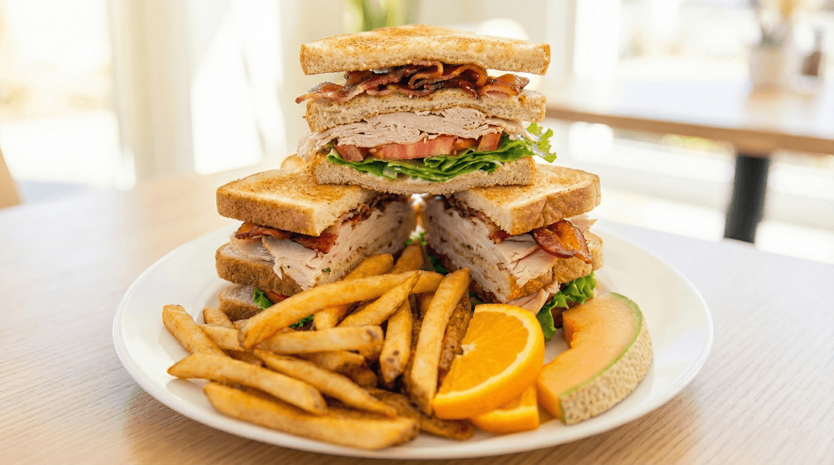
Club Sandwich
Triple-stacked layers showcasing turkey, bacon, and fresh ingredients. The horizontal presentation highlights portion size and premium components.
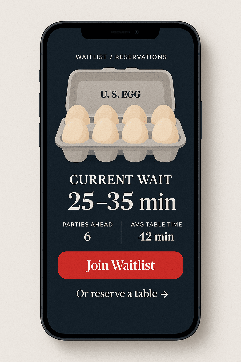
Mobile App Featured Special
Hero ad format optimized for digital displays and mobile applications. Clean, professional presentation emphasizes quality and value.
Additional Style Examples
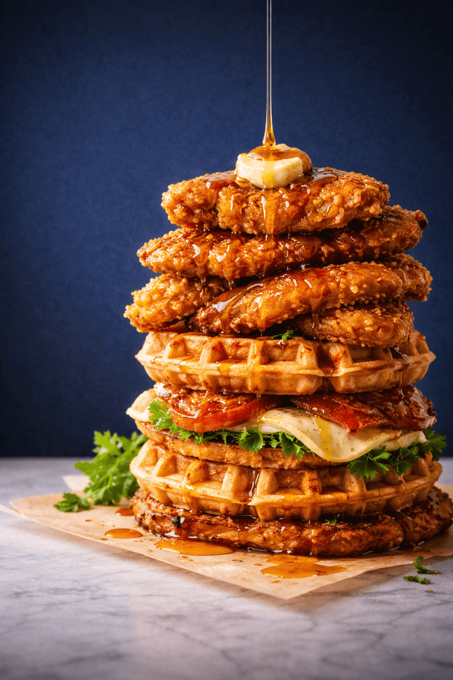
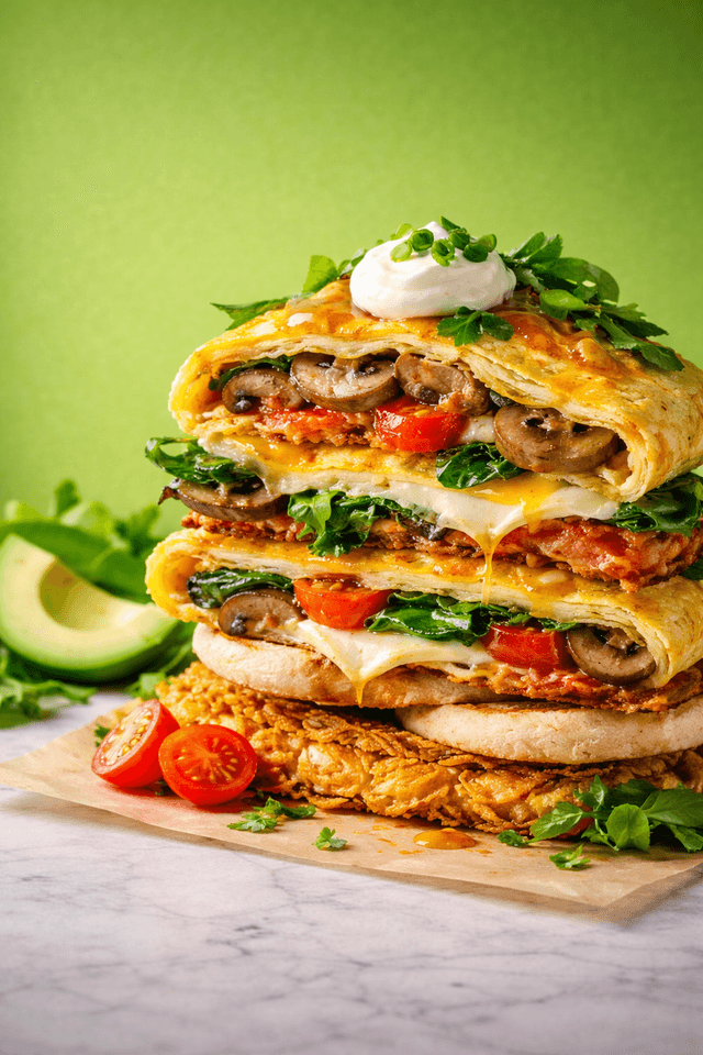
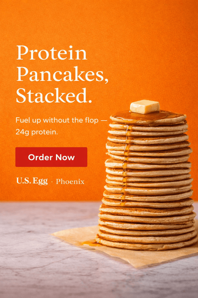
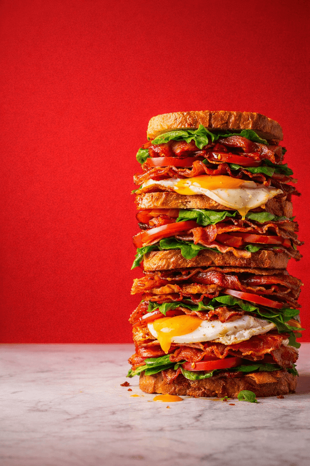
Key Takeaways for Hero Ads
Menu Design Strategy
By shifting to an open editorial hierarchy with elegant Playfair Display headers, semantic color zones (Navy for structure, Sage for wellness), and nested pricing, we elevate the brand to a premium standard that effortlessly guides guests toward high-margin items and add-ons.
Six-Zone Menu Architecture
The Foundation (Side A - Left)
Target: The Traditionalist
Speed & Familiarity
Key Items:
- • The Cornhusker
- • Traditional Eggs
- • Benedicts
Strategy:
Reduce decision fatigue. These guests know what they want; give it to them immediately in the first column.
Design:
Standard Background (Clean/Fast)
Indulgence (Side A - Center)
Target: The Experience Seeker
Flavor & Trends
Key Items:
- • Pumpkin Spice Pancakes
- • Sweet Waffles
- • Hot Skillets
Strategy:
Trigger impulse orders using high-visual-appeal items. This is the “fun” center of the menu.
Design:
Hero Photography (High-Res Visuals)
Functional Fuel (Side A - Right)
Target: The Wellness Customer
Guilt-Free Ordering
Key Items:
- • Protein Pancakes
- • Keto Items
- • Veggie Skillets
Strategy:
Stop the wellness customer from feeling restricted. Give them a dedicated “lifestyle menu.”
Design:
Sage Green Background (#f5f8f0)
Hand-Crafted Lunch (Side B - Left/Center)
Target: The Lunch Anchor
Value & Satiety
Key Items:
- • Big Daddy Burger
- • Club Sandwich
- • French Dip
Strategy:
Validates the lunch decision. Hero photos signal U.S. Egg is a serious lunch contender.
Design:
Hero Burger Photo (Appetite Appeal)
The Liquid Margin (Side B - Right Rail)
Target: The High-Check Guest
Profitability
Key Items:
- • Vodka Flights
- • Mimosas
- • Fresh Juice
Strategy:
High Margin Visibility. Move cocktails to the prime right-hand rail to boost drink attach rates.
Design:
Navy Header (#1A1E3B) for Alcohol
Junior / Senior (Side B - Lower Right)
Target: The Price-Sensitive Guest
Accessibility
Key Items:
- • Smaller Portions
- • Lower Price Points
Strategy:
Remove price barriers without cheapening the brand. Dignified, subtle presentation.
Design:
Subtle & Dignified (No Red Alert Boxes)
Visual Layout Reference
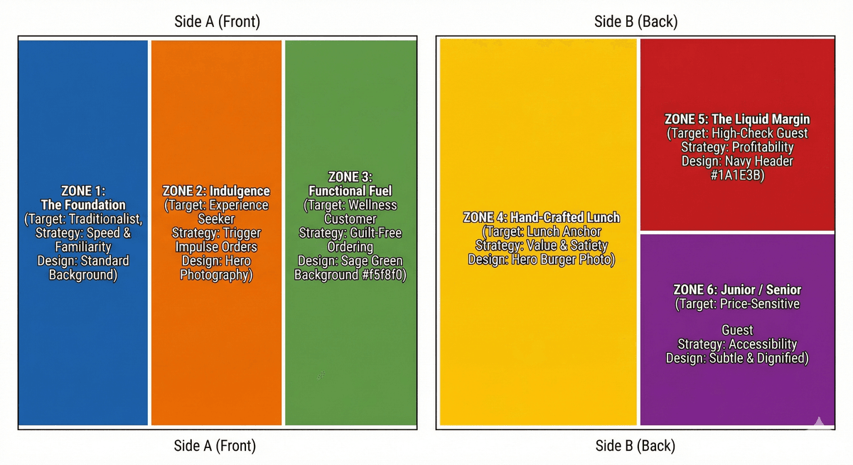
This reference shows how the six zones are organized across a two-sided menu, with each zone strategically positioned and color-coded to guide guests through the ordering experience.
2026 Menu Recommendations
Design Standards
- ✓ Illustrations & 4-color design elements
- ✓ Non-folded menu or menus format double sided with inserts
- ✓ Organized zones that are easy to scan
- ✓ Playfair Display headers for elegance
- ✓ Semantic color coding for guidance
- ✓ Nested pricing for clarity
Strategic Benefits
- ✓ Elevates brand to premium standard
- ✓ Guides guests toward high-margin items
- ✓ Enables easy promotion of add-ons
- ✓ Reduces decision fatigue
- ✓ Accommodates all customer personas
- ✓ Increases check average
2026 Menu Example
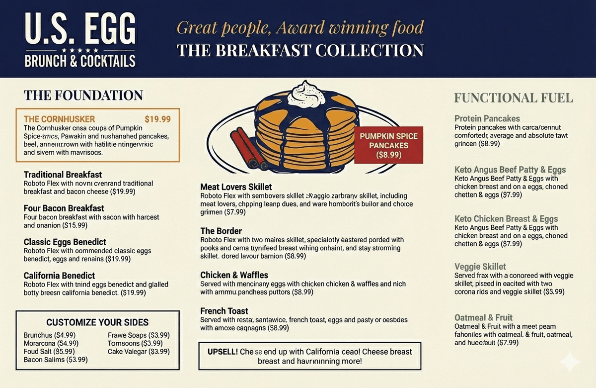
This example showcases the six-zone architecture in action, with clear sections for The Foundation, Indulgence, Functional Fuel, and color-coded zones guiding guests toward the best ordering experiences.
Download Brand Assets
Download official brand assets including logos, brand guidelines, and supporting materials. All files are ready for print and digital use.
Logo WebP
Modern format - best for web
Logo PNG
Fallback format for compatibility
Round Logo (PNG)
Round mark for social & mobile
Brand Guidelines PDF
Complete style guide
Logo Pack (AI)
Adobe Illustrator files
Need additional formats or have questions about brand usage?
Contact Us